Visualize data trends
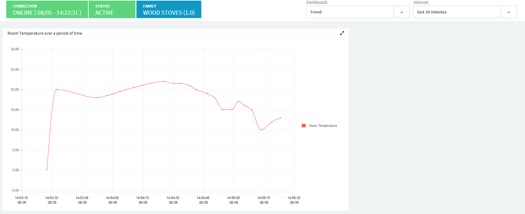
Trend widgets plots on a graph how data collected for several parameters varies over a time series.
As a result, we can have a broader view on how temperature changes over a certain period of time and visualize the aggregated information.
We have created a new dashboard called trend (which will contain only trend widgets) for the sake of the example. Still, it may be possibile to put this widget alongside other types of widget in a dashboard.
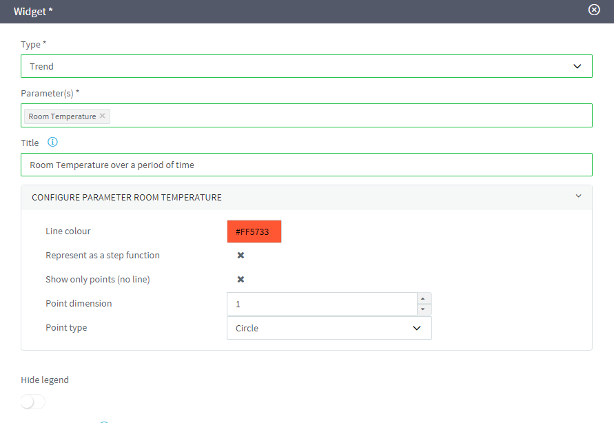
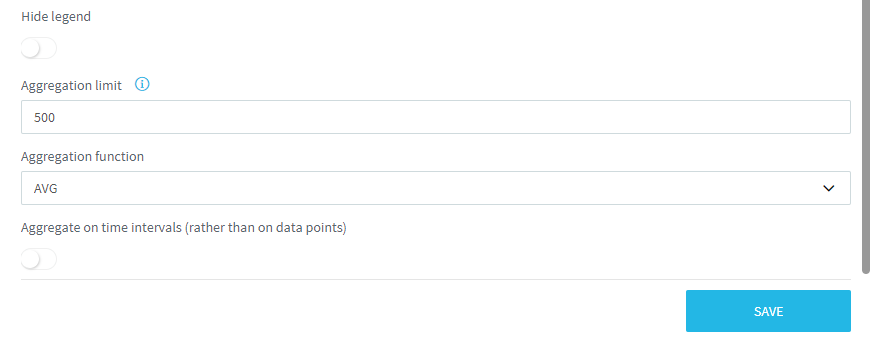
- Create a new trend widget on Wood Stove thing family by using the same configuration you see in the following images;
- Access to the trend dashboard for the Stove 001 thing;
- Connect to MQTT.fx and send temperature data (as we have already seen for other widgets in previous sections);
- Set the interval in order to visualize data within the last 20 minutes;
- Visualize the values on the trend graph.